Menu
-
- Sedans & Hatchbacks
- Small Crossovers (CUVs)
- Large Crossovers (SUVs)
- Sports Cars
-
Other Models
-
Wheels & Tires
- Lifestyle
-
Detailing
- Mazda Added Protection
-
- Customer Portal
- 1-833-509-1460
- Login
-
English

Sedans & Hatchbacks
Small Crossovers (CUVs)
Large Crossovers (SUVs)
Sports Cars
That's a Mazda Logo?!?!?!
June 29, 2017 3 min read
The Logo - a small, yet powerful icon that's proudly added as the "Cherry-on-top" to showcase a company's innovations. Logo designs evolve throughout years in order to provide a refreshing and updated look to match the evolution of the company.
It's amazing how every logo carries a history with it.
Mazda Motor Corporation's (マツダ株式会社) actually began as the Toyo Cork Kogyo Co. Ltd - a company in Hiroshima manufacturing corks back in 1920. Jujiro Matsuda becomes the president in 1921, but the name Mazda was not introduced until 1931.
1934 -1954


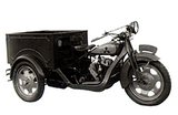
Here's where it all started - the first registered corporate logo appeared on Mazda's first three-wheeler - the "Mazda-go".
Prior, Mazda had only been manufacturing tools and heavy machinery. The word "Mazda" comes from Ahura Mazda - the God of Harmony, intelligence and wisdom in early Asian civilizations. Not to mention "Mazda" sounds very close to the pronunciation of it's substantial founder - Jujiro Matsuda.
1936 - 1959

Emerged in 1936 - this logo represents the flow of the river of their roots - Hiroshima. It also forms the latin alphabet letter M, which is seen repeated 3 times to represent Mazda Motor Manufacturer. This logo is crafted to look like soaring wings (the long side extensions) which is meant to represent agility, speed and ability to soar to new heights.
1951 - 1972

マツダ (Ma-tsu-da; Matsuda) Registered in 1951 - the year Jujiro Matsuda's son; Tsuneji Matsuda took over as president of the company.
1954 - 1974

As the company began to grow as they started to export the three-wheel truck overseas, this logo was adopted for overseas countries.
1959 - 1974

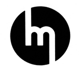
The next logo replaced the triple M logo, and focused primarily on the M and the wings were removed as well. This logo debut coincided with the beginning release of Mazda cars.
1975 - 1997

This timeless logo was introduced in 1975, and between 1991 - 1997, there were five different types of brand marks that were adopted by sales channel.
1991 - 1992

This logo was adopted to represent a sun and flame - which stood for heartfelt passion and a circle of light.
1992 - 1997

This is an updated version of the 1991 symbol in order to reduce it's similarity to Renault's logo. The edges of the diamond were smoothed out.
1997 - 2015


Completely refreshed - this logo brought back V-shape wings shaped like a letter M inside an oval; which stood for "growth" and "improvement". The wings are also suggestive of Mazda's flexible thinking, creativity, vitality, kindness and resilience. This logo represented Mazda's determination to "pursue ongoing improvements to drive powerful, continuous growth". Mazda was committed and determined to stand up to seemingly impossible challenges in order to craft cars with excellent quality and new technology. The spirit of Mazda lives in its brand symbol.
2015 - CURRENT


Renewal of the previous logo, this logo displays the evolution of Mazda towards higher quality and sophistication.
In all of Mazda's corporate mark, all the letters except for the letter D are in lower cases. This was a special design Mazda wanted in order to express the precision and reliability as a car company through aligning top and bottom lines of its corporate mark. The decision to used a letter D was to make the mark neatly fit into a rectangle, as a lower case d would have protruded the upper line.
The name Mazda and it's brand symbol comes a long way, bringing the story of its long history, burning aspiration and unwavering belief.
Are you a fan of the original Mazda logo?
We just stocked up on a few Mazda Vintage shirts featuring the 1934 and 1936 logo!
You can get them here!
But you better hurry, we only have a few in stock!


